Resource guide — Updated 10 August 2026
Interior Colour & Finish Guide
How to choose interior colours and finishes room by room, and avoid mistakes.
Interior Colour Planning
Interior Finish & Colour Guide
Use this Interior Colour & Finish Guide to match walls, ceilings and trim with the light, wear and atmosphere of each room.
Starting With Light and Aspect
The single biggest factor in how a colour looks on your wall isn't the colour itself, it's the light hitting it. A room facing north gets warmer, more direct light through the day, while a south-facing room stays cooler and flatter in tone, and both will change a colour's appearance compared with how it looked on a swatch under shop lighting. Rooms with limited natural light, common in some older North Shore homes with smaller window openings, often need lighter, warmer colours to avoid feeling closed in, while bright, light-filled rooms have more room to carry deeper or cooler tones.
Existing fixed finishes matter too. Floorboards, tiles, benchtops and any built-in joinery that isn't changing should inform the colour choice, since a wall colour that clashes with an undertone in the flooring or stone will bother you every day in a way a swatch on a wall never shows.
Understanding Sheen and Finish Levels
Matt and low-sheen finishes are popular for walls because they hide minor surface imperfections well and give a soft, contemporary look, but they can be harder to wipe clean than higher-sheen options, which matters in high-traffic areas. Satin finishes sit in the middle, offering a bit more durability and a subtle sheen, and are a common choice for hallways, kids' rooms and other areas that see more marks and cleaning.
Semi-gloss and gloss finishes are more durable again and easier to wipe down, which is why they're the standard choice for trim, doors and skirting rather than whole walls, where a high sheen would show every roller mark and surface flaw. Matching sheen to the room's actual use, rather than choosing purely on look, avoids a finish that looks good on day one but doesn't hold up.
Getting Ceilings Right
Flat white remains the standard ceiling choice for good reason: it reflects light well and recedes visually, making rooms feel taller and brighter. That said, a coloured or even a slightly warmer off-white ceiling can work well in specific situations, such as a room with an interesting ceiling feature, a lower ceiling height where a wall colour is being carried up to unify the space, or a deliberately cosy, enclosed feel in a smaller room.
A common mistake is assuming any white paint will do for a ceiling; ceiling paints are usually formulated slightly differently to wall paints for better application and touch-up blending overhead, and using a proper flat ceiling paint rather than leftover wall paint generally gives a more even, less patchy result.
Trim, Doors and Skirting: Contrast or Tonal
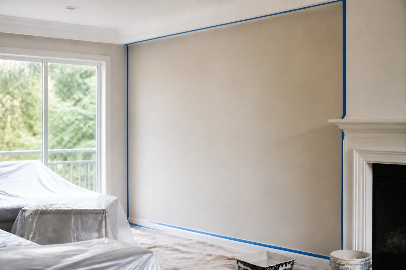
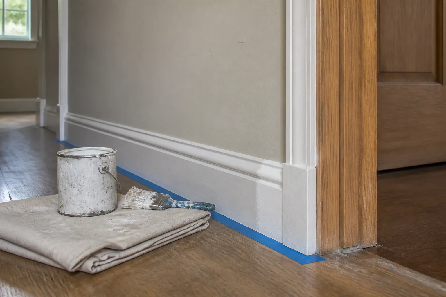
A crisp white trim against a coloured wall is the most common approach and works reliably in almost any home, giving clean definition to doors, skirting and architraves. A tonal approach, where trim is painted a slightly different shade of the same colour family as the walls, gives a more subtle, cohesive look that suits a more contemporary style. Darker, contrasting trim is a bolder choice that can look striking in the right room but tends to draw more attention to any imperfections in the timber or joinery underneath it, so it's worth thinking through carefully before committing.
Whatever approach is chosen, consistency through connected spaces, hallways into living areas for example, generally reads better than a different trim treatment in every room.
Testing Colours Properly Before Committing
A small swatch on a paint chart or even a small patch on the wall isn't enough information to commit a whole room to a colour. Painting larger sample boards, at least A3 size, and moving them around the room to see how the colour reads in different corners and at different times of day gives a much more reliable picture than a small patch viewed under one light source.
It's worth checking a sample colour under morning light, afternoon light and artificial light in the evening, since paint colours can shift noticeably between these. This is especially relevant on the North Shore, where tree cover and block orientation can mean two rooms in the same house get quite different natural light through the day.
Matching Finish to Room Use
Kitchens and bathrooms deal with moisture, grease and frequent cleaning, so a durable, wipeable finish matters more than in a formal living room. Kids' bedrooms and playrooms benefit from tougher, easier-to-clean finishes for the same reason, given the inevitable marks near skirting height. Hallways and stairwells, which see a lot of foot traffic and the occasional knock, also do better with a finish a step more durable than a standard low-sheen living area wall.
Formal or lower-traffic rooms have more flexibility to prioritise look over durability, since they simply don't take the same daily wear as a busy kitchen or family hallway.
Sources & further reading
Authoritative references for the safety, planning and product considerations discussed in this guide.
Frequently asked questions
Quick answers to follow-up questions on this topic.
Matt and low-sheen finishes hide imperfections well but are harder to wipe clean, satin sits in between with a bit more durability and light sheen, and semi-gloss is the most durable and easiest to clean, which is why it's the standard choice for trim, doors and skirting.
Flat white is the standard choice because it reflects light and makes rooms feel taller, but a coloured or warmer ceiling can suit specific rooms, particularly lower-ceilinged or cosier spaces, or where a feature ceiling is part of the design.
It's worth testing at least one large sample board, ideally A3 size or bigger, in the actual room, viewed at different times of day, rather than relying on a small swatch or a patch of paint straight on the wall.
Both approaches work: crisp white trim against a coloured wall is the most common and reliable option, a tonal trim in a related shade gives a more contemporary, cohesive look, and a contrasting darker trim is a bolder choice that suits some homes but shows imperfections more readily.